Friday, April 9, 2010

Illustration Artist Honet


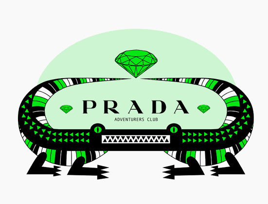
These works are done by an illustrator named Honet. This Paris based graffiti artist made some great stuff for Prada. "I started graffiti in 1988, painting some walls along the lines tracks and on trains beginning of the 90', in Paris, then across all Europe from London to Bucharest, from Helsinki to Athens." I really really really like these! I like even balanced clean work, and thats black and white with hints of colour.
This series is defiantly a LassLikes.

Thursday, April 8, 2010

Seed Cathedral


This is the called the "Seed Cathedrak". The Organizers of the 2010 World Expo, as well as construction workers are busily working towards being fully organized for the planned opening of the 2010 World Expo in Shanghai, China on May 1, 2010. The specific event is planned to be the largest World Expo in history ever since it began in 1851 with the Great Exhibition at London's Crystal Palace. The theme of the Expo is "Better City, Better Life", and is scheduled to run until October 31, 2010. I love this building it glows with envy. I love the idea of the seeds being places in the outer pieces. I like that it tricks ur eye in some sort of way that it makes it look like its moving.
This building is defiantly a Lasslikes

Wednesday, April 7, 2010

Paper Hair Installation


This Paper Hair Installation is in Atlanta and New York. The illustration is done by Amy Flurry and Nikki Salk. I like how the artists just uses white paper and shadows to create depth and interest in there pieces. I enjoy the attention to detail of each cut and bend of the paper to create a visual form. I am impressed by the skill and time it takes paper artist to complete their work because it does take a long time to make them. I know this because of a previous project of which I have tried to create a paper piece.
This paper installation is defiantly a LassLikes.

Basket Bin


The basket Bin is created by 2 modern. Well this would certainly make separating your trash easy and straightforward. The small bin is perfect for compost, as it can be easily carried to your nearest compost heap and is dishwasher proof. I like the design of this bin because it fixes a problem of compost. The only thing I would change is that I wish the basket design could be somehow modified to fit on all smaller garbage cans but overall I liked the idea.
This bin is defiantly a LassLikes.

Monday, April 5, 2010

Retro Art Supplies


These are some images from a Flickr photo stream that consists of vintage art supply photos. There are tons and tons of images of different vintage crayon, paint, graphite, pencils, and other various art supplies in this folder. Seeing all these different boxes really interested me because of the bold and solid patterns. The boxes gives us a view into the past of previous artist people and into design during that century. This connects to the adventurous uncommonly used type faces that were used during that time. This photo stream was fun to look through and I still haven't been able to go though all the photos.
This photo stream is defiantly a LassLikes

Here the url http://www.flickr.com/photos/christianmontone/sets/72157621956466987/)

Sunday, April 4, 2010

How Doos


Howdoos is the new way to make bussiness cards for everyone + anyone? They have a message on the font,which currently your choices is between "hello" and nice to meet you. There are 3 lines on the back to add ur information on the back. The design of these howdoos are still nice but the design has been done many times before.The design that has been done before is the strong bold helvetica or helvetica look alike typeography placed to the side. The idea of the howdoos is really what makes this specail. These cards are sold on www.etsy.com and come in packs of 10 and are 6 dollars us. I think this bussiness impower the simplicity of a hello and a nice to meet you and because of think this idea is good one.
These cards are defiantly a Lass Likes.

Thursday, April 1, 2010

Young Designers

My decent designism project in school has to due with the awareness of design to young high school students. Through my research of the topic I came across a cool high school in Los Angeles it is free public charter school.

Here is the school URl: http://www.thedesignhighschool.org/

The school focus on uses design as an idea to solve challenges, by using hand-on projects to promote higher thinking students. The school inforces connection skills, and knowledge across all subjects. I find this school interesting because it was one of a small amount of schools focused on just design. I like the ideas and theories this school teaches its students, and I wish I secretly went there in high school.
This school is defiantly a LassLikes.

Wednesday, March 31, 2010

Pug Illustrations by Bryan Ballinger


This is a series of Pug illustrations by Bryan Ballinger a recent illustrator who I have come to love. I am drawn towards him because of his heavy black illustration style. This is because me myself have a similar style. I love when artists use just black and white, because they are the most extreme sides of the color scale. I like how he focused on his placement of every line to make sure the piece turned out how he wanted it to. My favorite thing about these illustrations is the sometimes crazy emotions he makes the pugs faces. It brings a bit of humor and a smile to your face. Overall this series of illustrations will put a smile on your face while still being detailed and thought through.
This series is defiantly a LassLikes.

Monday, March 29, 2010

Flow of Nature Stilled


I really like this photo. I just stumble upon this photo there was nothing about the photographer, but I just love flow of the hair with the branches.There are 3 contrasts in this photo that makes it beautiful. The first contrast would be between flow of the hair and the model strong facial feature. It makes the shot feel like it has been frozen in time. The second contrast, would be the between the red bright hair and the green branches. It gives the photo tons of depth, which makes it more interesting. The final contrast would be between the models pale white skin and the baby blue sky. It makes the shot feel more open and bare. Overall this photo is inspiring to photographers, and shows the true beauty of nature and humans together.
This piece is defiantly a LassLikes.

Sunday, March 21, 2010

Nowness


Nowness is a new website I have come to like. Nowness is a chic sleek, simple site that is easy to use. Everyday one post is made about everything that is in the now. Users can either choose between "Love" or "Dont Love" for each post. There is also an exploring option where it will give you a random post article. There is arrows if you want to go though the article posts by date. This qoute from the site truely speaks about what Nowness is trying to achieve.

"Every day our lives are punctuated by moments of inspiration, from an unexpected smile on the street to an encounter with an astonishing work of art. But Nowness is more than just a moment, it is a thought you carry with you.

Nowness is an exciting new way to experience luxury lifestyle online, featuring daily content from the most respected and innovative creatives working today."

In this quote I really agree that our lives are truly punctuated by moments of inspiration. From reading this I am going to know try to notice and capture these moments as much as I can. Here is the url for the site www.nowness.com. Overall this website is a great resource for exploring different works of art,and pieces to inspire your mind.
This website is defiantly a LassLikes.

Fresh Handbag Design


This bag is from Wong Wong. It combines two bags stitched together and latch being attached. This makes it able to hold anything from yoga matts, newspapers, magazine, laptops, etc. There is also a smaller leather patch pocket on the inside for your smaller things. I find this bag to very interesting idea because I myself have come into many situations where I could of used this good idea. The inner area to carry things makes traveling alot easier especially for public transit citizens heading to places like the gym or school. Outside of the bag being a good idea the overall design of the bag is kept elegant and modern by the black and white. What sets this bag to sell is the simple Wong Wong logo. This is because the logo is beautiful by the symmetry of the W's and the clean sans serif font. I like how the designer choose to make the inside patch a classic leather because it gives a softness to the bag's black and white coloring.
This bag is defiantly a LassLikes.

Thursday, March 18, 2010

Scale


An interesting scale thats thought provoking. It tells you what you should eat instead of your wieght. Its thought provoking because it destroys how society is focused on weight, by consternating on what you really should be. What you eat.
This is definatly a LassLikes.